
Overview
To the layman, looking at any forex chart seems complex. Yet in no time, they become easy to read. A chart is nothing more than a visualization of the price of a forex pair over many time frames, ranging from minutes to months.
Having competent charting skills is a crucial component of technical analysis – an approach used by the majority to make trading decisions and predict price movements. Every trader utilizes a specific chart for different purposes, with some employing more than one kind at a time.
While most of the literature suggests three forex charts, technically, more exist in other trading platforms. However, in this article, we’ll specifically look at line, bar, candlestick, Renko, and Heiken Ashi charts as they are the most commonly utilized in forex.
Line chart
A line chart is the most simplified chart type. It connects various closing prices with a continuous line. Unlike bars and Japanese candlesticks, a line chart only considers the closing price, which is why it’s quite stripped-down.
Beginner traders may find line charts less intimidating to use, making them more suitable. However, while they provide the benefits of clearness, they are quite limited for advanced analysts and aren’t used by the majority of traders.
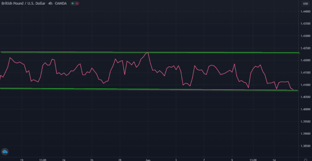
Nonetheless, let’s look at the image above to observe one way some could utilize line charts. Since line charts appear less cluttered than other charts, they can easily show support and resistance.
Bar chart
A bar chart consists of vertical lines with each reflecting the highest and lowest price in an observed period. The image below demonstrates how a bar chart shows prices.
The small horizontal line on the left side of the main vertical one shows the opening price, while the small horizontal line on the right side shows the closing price. The high and low prices sit at the top and bottom of the vertical line, respectively.
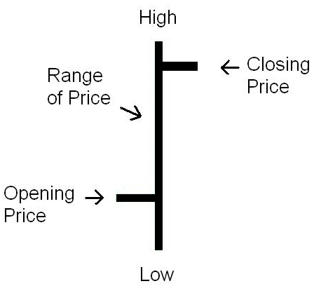
A bar chart is rather simplistic but is used by a few to gauge the general market condition with more ‘cleaner’ visuals. Although bar charts might appear like candlesticks from afar, they are less cluttered since there are no wicks.
So, from a visual perspective, some traders find it easy to tell whether a market is trending or consolidating using bar charts. Above is an image of a typical bar chart.
Japanese candlestick chart
Japanese candlesticks are the most popular type of charts used by traders in many other financial markets aside from forex. They are dynamic and graphically aesthetic, forming the backbone of all the price action in the markets.
Like a few others, these charts are credited towards Japanese traders like Munehisa Homma, who was active in the 1700s and 1800s. Candlesticks provide the four critical pieces of price information; open, close, high, and low.
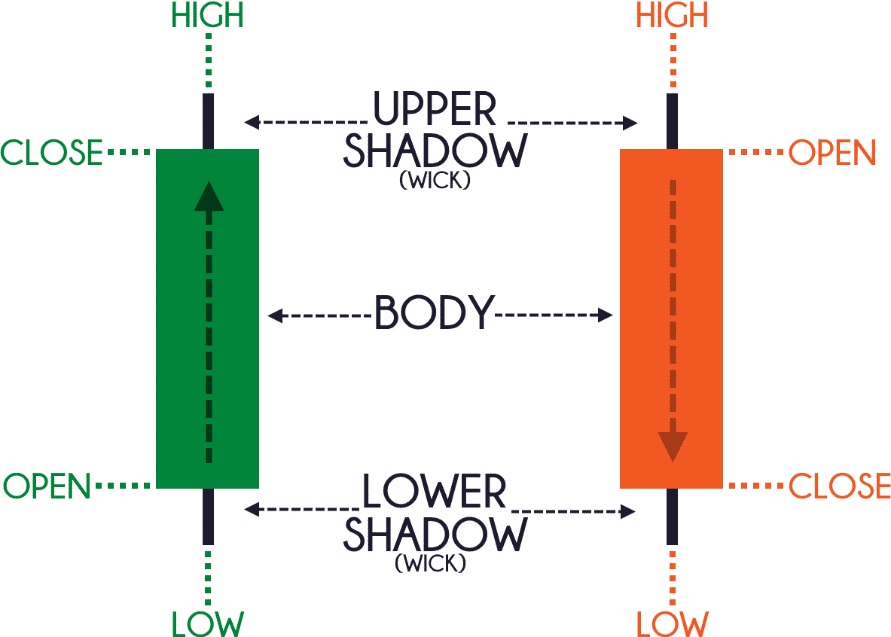
The image above is the simplest candlestick referred to as a Marubozu. Candlesticks are unique due to the various patterns they form and the story they tell. If we refer back to this picture, this type of candle signals strength, with the green suggesting buyers’ dominance while the red signifies sellers’ power.
The information helps forecast which group of traders is likely to dominate the next session. Other patterns, such as pin bars, reflect how wicks form in relation to the candle’s body. A noticeably long tail with a small body suggests price initially went one way before sharply changing to another, which hints momentum to the new direction is likely.
Above are some examples of the power of candlesticks – the evidence as to why they are so popular.
Renko charts
Renko charts, also created by the Japanese, are another chart type. From a glance, they look similar to candlesticks, but they are structured differently to filter out noise.
Research suggests the word ‘renko’ was derived from the Japanese term ‘renga,’ which literally translates to bricks. When viewed, Renko charts indeed do mimic a series of bricks. These blocks are angled at 45 degrees which are always the same size.
Renko charts are unique because they only consider directional movement rather than time, unlike candlesticks with a specific period depending on the time frame. So, for instance, if the price kept trending higher for a full 24 hours, rather than being represented by different shaded candles, this will be reflected with just one green bar.
It is this attribute making Renko charts noise-filtering and streamlined, allowing traders to see trends more clearly. A common belief with Renko charts is when the bars change color, this signals a possible real change in price direction.
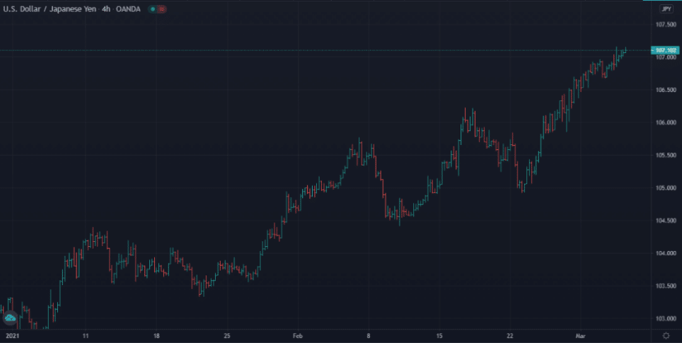
Even though they lack the sophistication of candlesticks, they are beneficial for looking at long-term trends and filtering out noise. In the image below, we can see the differences between candlesticks and Renko.
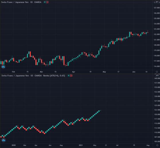
The latter exhibits the price direction more generally, while the former provided more whipsaws and a greater mixture of bullish and bearish candles.
Heiken Ashi charts
Heiken Ashi charts share many characteristics with candlesticks and Renko. The words’ Heiken Ashi’ mean ‘average bar’ in Japanese. Like candlesticks, Heiken Ashi candles also reflect the open, close, high, and low, except they use a special formula considering the average price instead of the real one.
The result is a much smoother-looking chart, very much like Renko. Traders use Heiken Ashi to stay in trends for longer without exiting their trades due to whipsaws as they might with candlesticks.
These charts can be more reliable indicators of reversals as a color change is rare than candlesticks, especially on higher time-frames.
While candlesticks are dynamic and alternate colors and formations between trends, the Heiken Ashi will tend to show one dominant color for a more extended period, and signaling price is likely to persist in one direction.
Final word
Traders are spoilt for choice when it comes to technical tools like charts, which all perform different functions. The majority of investors use candlesticks, with some alternating between Renko and Heiken Ashi at certain times.
Others might occasionally use bar charts. Let’s summarise the main function of each observed chart and its popularity.
- Line chart: most straightforward to use; good for beginners but not for intermediate and advanced traders; rarely used by the majority because of its limited qualities.
- Bar chart: similar to candlesticks but less dynamic; suitable for noise-filtering; somewhat popular.
- Candlestick chart: most visually appealing; creates various repeatable patterns which give a lot of information; highly dynamic but also noisy; very popular.
- Renko chart: comparable to candlesticks; better for noise-filtering than bar charts; they’re smoother looking than candlesticks but not as dynamic; excellent for defining long-term trends and reversals; popular with experienced traders.
- Heiken Ashi: the chart is similar to Renko and candlesticks; brilliant for showing smoother price movements; beneficial for also defining long-term trends and reversals; allows traders to stay in trends for longer; well-known with advanced analysts.

Leave a Reply