Point and Figure Charts (P&F) has been described as one of the simplest systems that help traders determine solid entry and exit points, usually in long-term investment markets such as stocks. P&F charts are used to monitor supply and demand while keeping an eye out for developing trends. The P&F charts differ from other charts, as they do not account for the discrete passage of time as other charts do along their x-axes.
While P&F charts have been used in stock trading, there are ways in which it can be applied in forex trading as well. The main thing about Point and Figure Charts is that not all days are equal, as it attempts to filter the daily noise and focus on market moves.
The History of Point and Figure
The first theory associated with point and figure appeared around the 1880s, only becoming popular in the late 1920s. This was a period in which speculation on the American stock exchange became popular. While some other theories of the time were based on the time element, for example, the Elliot Waves Theory, the Point and Figure theory were born in the bucket shops where traders started to record prices.
In the early days of technical analysis, some traders began noticing certain patterns that were documented and the outcome was used to forecast prices. When recording the price of a stock, they were usually written on the vertical by traders. Thus, while a rising column would indicate that the price rose, a falling column would indicate the opposite, i.e. the price has fallen. The term “figure” thus emerged when the traders began noticing these patterns.
While writing down the price levels of various stocks, traders started to denote them by using “X” s to save time. A chart covered with “X” s came to be known as “point” charts. Eventually, the two elements were combined to form the Point and Figure Charts.
The Trading Concept Behind Point and Figure Charts in Forex
Both Experienced and Savvy traders tend to maintain their charts manually. However, P&F charts tend to distort the time. This means that the chart needs updating only when the market moves. This gives traders plenty of time to update the charts, regardless of the number of markets traded.
As inferred from the above discussion, Point and Figure charts aim at filtering the non-moving days, which differs from classic charts which shows all the days, regardless of price action. However, in this case, the theory implies that some trading days are more important than others and thus show the days where the market has moved.
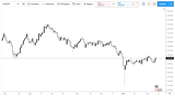
To better understand this, let’s take an example of a EUR/JPY daily candlestick chart.

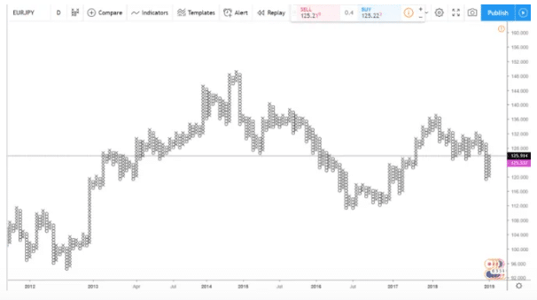
Here, each trading day is represented by a candle stick. The above chart shows everything, regardless of the price action. However, if the trader proceeds to apply the P&F on the same currency pair, the chart looks entirely different as seen below.

In the above chart, the P&F chart depicts the price action for the previous seven years. The chart eliminates consolidation times by considering only the relevant days. Therefore, Traders open and close positions, only when the market is on the move when they’re using P&F charts.
Using Point and Figure Charts can have many advantages. Firstly, it can avoid negative swaps and saves margin. This allows traders a more free margin for trading. It also saves on commission costs. Therefore, cost-efficiency can be considered as the main reason for using P&F charts as it avoids unnecessary costs when trading with currencies.
How to Build a Point and Figure Chart
Today’s Point and Figure Charts show a series of X’s and O’s, with the X representing a rising column or rising market while the O’s are indicative of a falling column or bearish activity. The theory requires traders to set the rules for what the price needs to do, for the price move to be considered either bearish or bullish. This is called the “boundaries of a break”.
Traders generally use the Average True Range indicator on the chart. The chart uses an ATR of 14 for plotting either a new X or O. This means that every time the daily range exceeds the ATR (14), the trading platform plots a new X or O.
There are two possibilities that exist when plotting a point and figure chart, depending on what the chart considers. These are given below.
- The first option involves the trader looking at the closing price for the previous day. In this case, when the distance from the opening to the closing price exceeds the ATR(14) , the chart plots a new X or O.
- The second option involves using the High/low distance instead of considering the closing price.
How to Read a Point and Figure Chart?
As mentioned before, a P&F chart consists of columns of X’s and O’s which are indicative of either an uptrend or a downtrend in the price, respectively. The chart also contains some numbers and letters which represent the beginning of a month. For example, September is denoted by 9, October is denoted by A, etc.
P&F charts define a minimum price movement called “Box Size” to eliminate any minor price fluctuations. Any price rise or fall which is less than the indicated box size is not considered and indicated in the chart. Prices can also reverse, in the amount of “reversal size”( usually 3) multiplied by the Box size, which usually causes a column change from X to O.
For example, for the EUR/USD pair, AN uptrend is detected if the box size is 30 pips and reversal size is 3 (R:3). The trader will have a column of X’s. While a price increase of more than 30 pips over a period of time adds more X’s, a price decrease of more than 90 pips would cause the trend to reverse and create a column of O’s.
Conclusion
For a theory that dates back more than a century, point and figure charts still provides an excellent market overview, regardless of the financial market traded. This includes markets for currencies, indices, CFDs, commodities, bonds, and others.


Leave a Reply