Table of Contents
Forex charts are your platform where you will be able to make money in Forex. It is essential for your trading performance to understand what you should know and how to read those tools you know.
It could be hard to make a dollar in Forex, but it is not impossible. If you know the principle of forex charting, you will have much gained in your trading career. Today we will talk about how to read FX charts and what you should know to trade Forex.
A forex chart is a visual tool to read price movements in a determined period of time. It could be with lines, bars, or ticks, but it will always show where the price of a pair or index is. So, it would help if you had a chart to make better trading decisions in Forex.
However, let’s start by the beginning. How do you get a Forex Chart?
How to access to Forex Charts
Before being able to learn the art of reading charts, you should get one. But what is the better chart? Forex charts are everywhere, yet not all the graphs are the same.
Reading charts is fundamental for every trader, so each fx broker will provide you with a platform solution that is a trading station with charts and tools. Thus, the first place to look for an FX chart is your broker.
Besides that, other open platforms usually support many forex brokers accounts such as TradingView or the different versions of Metatrader. Finally, you can also access to general economic websites charts offerings to see prices. Note that regular websites have delayed prices. So, the prices you are watching are 15-minute delayed on average.
Every platform will present different settings, tools, and visual conditions. Be sure that those options fit with your trading skills.
What to read in a Forex Chart
Now, let’s talk about the items and number we will need to understand and read while using a forex chart.
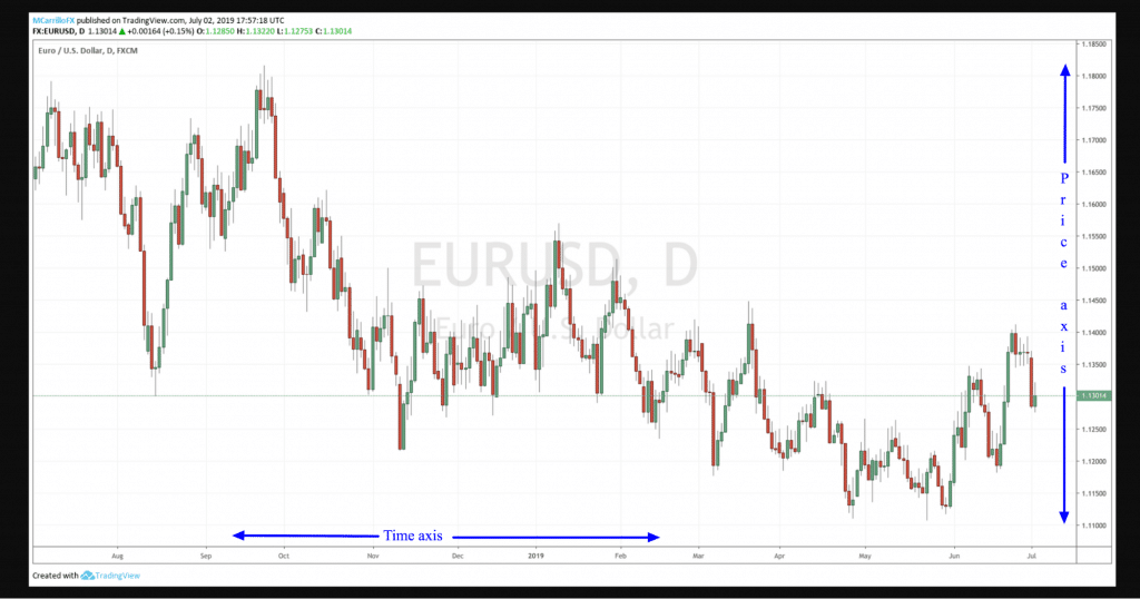
Time axis and price band
Almost all charts in the Forex world have the time axis in the bottom of the chart. Also, prices are shown in the right column next to the table. So you are going to see a cross between bot axis while you are navigating the graph. Usually, prices are posted from the bottom to the top prices the time axis has.
Remember, time is at the bottom, prices are at the right band. It will all depend on the timeframe, but we will talk about that later.
Exchange price and Pips
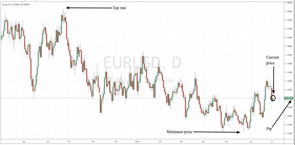
When you are watching a chart, you basically see price movements. Well, the main feature here is the price. In a platform, you are going to see a fluctuation of prices where each point moved is called a pip. Pip is essentially the minimal measure of a Forex pair, usually the last of the fourth decimal point.
Each movement of the price is a pair, in a chart platform you should identify where the price is, how much it is moving, what is the top rate as well as the minimum valuation. It will give you a sense of how the pair is performing.
Remember that when the pair is going up, it means that the currency in the first part of the ticker is going up, in this case, EUR, and the money in the second part is falling, the USD. Also, on the contrary.
Timeframes
Usually, every broker solution on charts offers different time intervals of time, also called timeframes. As a short term trader needs as a 1-minute chart, others would prefer a 1-hour or even 1-day timeframes.
The selected timeframe means that every period of a candle, tick or line that the chart shows will represent the selected period of time, or timeframe.
So, brokers offer multiple timeframes to address this necessity. In a chart, the timeframe is easily identifiable. You should only select the code you want to see, and it will magically appear. Like 1H if you’re going to see one-hour charts or 1-day in the case you want a daily graph.
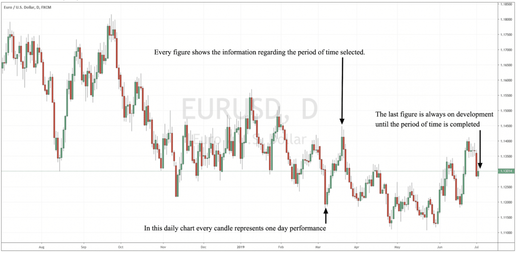
Chart types and patterns: Candlesticks, bars, and lines
There is more than one single way to watch charts in the Forex markets. The industry, like any other investment tool, has different forms to print price movements in a map.
Samples of charts are the famous wide candlestick, line, bars or point and figure, among others. Each different option provides users with specific information that you can use depending on your trading skills.
Candlestick charts
Candlesticks are one of the most popular ways of watch FX charts in the industry. Many traders prefer candles as they are very graphics and show all the needed information at first sight.
It is not hard to understand candlestick charts as they represent movements and reveals four vital information: Opening, closing, maximum, and lowest prices in the period. It is easy to understand the way the market is moving, up or down, with Candlesticks FX charts.
Line charts
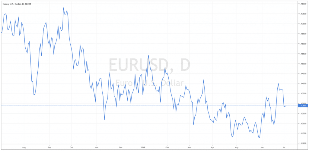
The basic form of visual price movement is Line charts. It represents the continuous performance of a Forex pair across a determined time. It could be set to opening or closing prices, and it is good to be used while identifying the big picture of a pair.
It doesn’t offer much information but a clear picture of trends and also to test strategies.
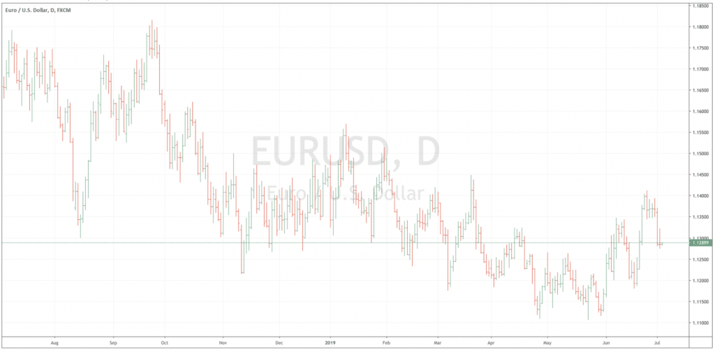
OHLC bar charts
OHLC bar charts are similar to candlesticks but not as much as visual as its Japanese relative. Its name stands by Open, High, Low, and Close. It is a line with two dashes, the dash in the left is the opening price, while the dash in the right represents the closing price.
This type of chart help traders to quickly understand who is in control of the game, the buyers, green lines, or the sellers, the red lines.


Leave a Reply