Many traders or forex robots work with time-based charts when it comes to technical or fundamental analysis. With time-based charts, a candlestick often represents price action over a given period. For instance, one bar could represent price action over one minute, five minutes one hour, or one day.
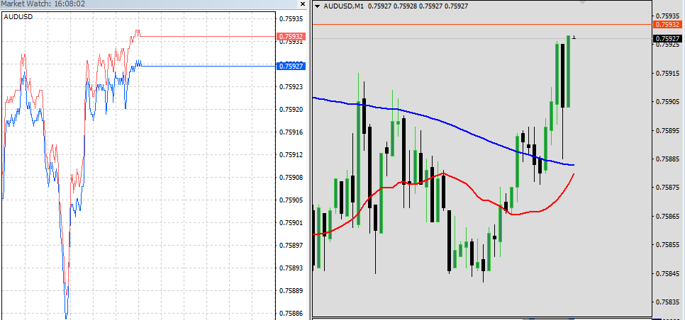
In addition to time-based charts, forex tick charts are becoming increasingly popular in supplementing various trading strategies from scalping to news trading as well as Arbitrage trading and position trading.
Tick Chart Basics
A tick chart is simply a chart whereby new bars appear after a specific number of trades. For example, a new bar can appear in a chart pattern after 50 trades, indicating a 50 tick chart. Similarly, a new bar can appear after 100 trades representing a 100-tick chart or after 200 trades representing a 200-tick chart.
While conventional time charts draw new bars after a set period of time, forex tick charts depict new bars after a specific number of trades hit the market. A tick, in this case, is a trade. A tick chart, therefore, represents the number of trades that go through the market
Tick charts allow traders as well as forex expert advisors engaged in automated trading to view price action from various data intervals. Therefore, these types of charts provide an effective way of looking at price action by focusing on data in the form of trades placed, rather than how a candlestick appears over a given period.
Advantages of Tick Charts Compared to Time Based Chart’s
Averts Market Noise
One of the biggest disadvantages of time-based charts is that they don’t avert market noise. In contrast, bars in tick charts appear after enough trades hit the market, consequently reducing market noise significantly.
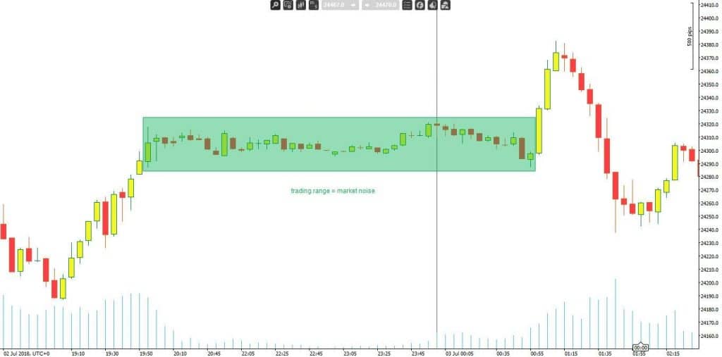
The chart below shows a 5-minute Dow Jones Industrial Average chart. It is clear from the chart below; traders, as well as algorithmic forex trading systems, had to contend with almost six hours of a trading range. In this case, there are more than 30 candlesticks providing useless information that traders cannot use to make informed decisions in technical analysis.
In contrast, a forex tick chart, of the same data points, compresses the six hours of trading information, to a few bars, as shown below.
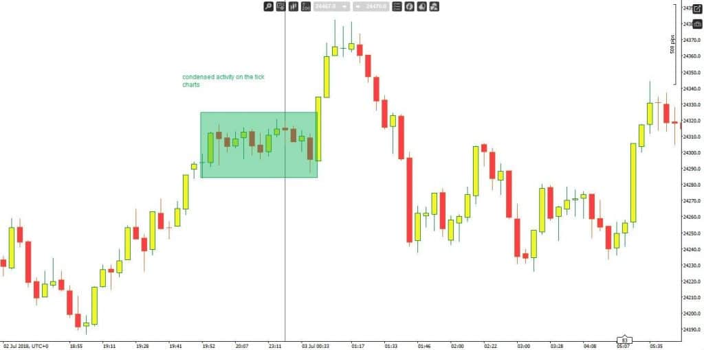
In the condensed forex tick chart above, it is clear that traders were able to get a clear picture of the overall market by focusing on well-defined candlesticks.
Provides More Information
Tick charts are proving to be more effective in technical analysis as they allow traders as well as FX Expert Advisors to gather valuable information about market activity. During periods of increased market activity, tick chart patterns tend to show more information as compared to time-based charts.
Some of the information that forex tick charts provide with certainty include price waves, consolidations as well as smaller-scale price. In this case, such chart patterns are important forex charting tools for identifying various price patterns in the market.
During periods of high volatility, time-based charts show long candlesticks. In contrast, tick charts show several small candlesticks that provide more information about market swings. Smaller candlesticks make it possible to ascertain price waves. Conversely, it becomes much easier to identify support and resistance levels.
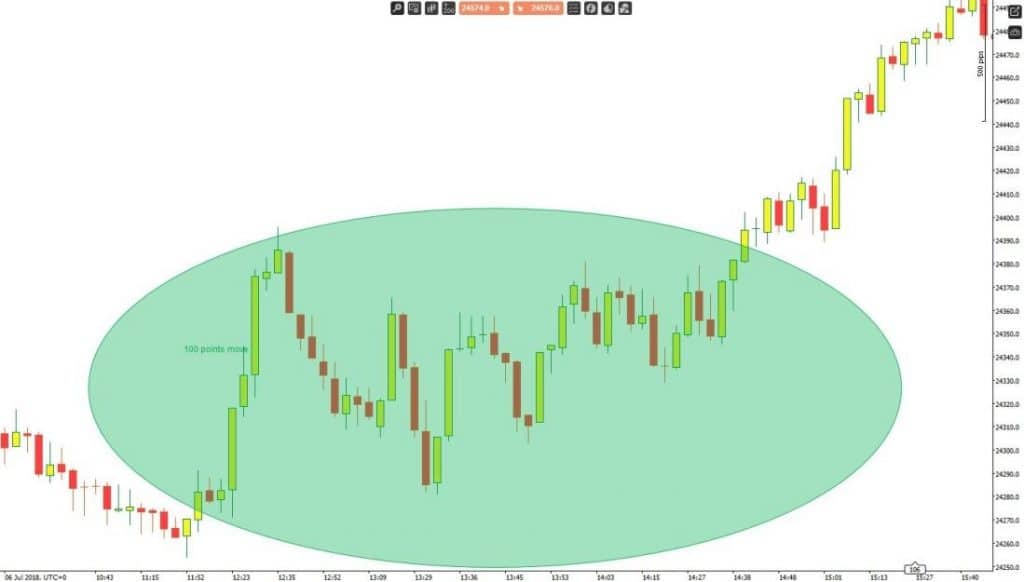
In the 100 tick chart above, it is clear that a trader or automated forex trading system was able to join the upward movement given the clearly defined price wave.
Ascertaining Market Volatility
In addition, forex tick charts are proving to be more effective in ascertaining market volatility depending on the rate at which tick bars fill over a given period. Therefore traders, as well as FX EA, can use them to see when the market is active, sluggish or barely moving, ideal for determining market volatility.
During periods of increased market activity, more bars appear in a tick chart. For instance, over five minutes, more candlesticks would appear in case of a 50 tick chart indicating people are placing orders in numbers. Conversely, few bars would print over five minutes in times of sluggish market activity.
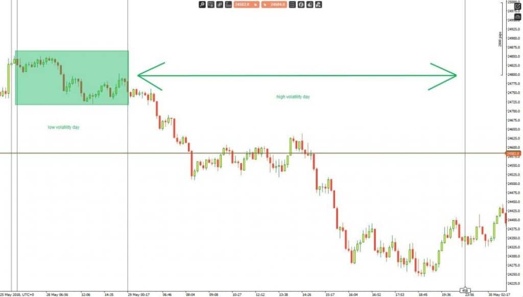
The forex tick chart above indicates two days of varying levels of volatility in the market. On the first day (shaded), there was a reduced level of volatility, conversely the reduced number of candlesticks. On the second day, however, an increased level of volatility increased the number of candlesticks as tick bars got filled quickly.
As one of the most important forex trading secrets, a trader or forex robot would have refrained from placing a trade at the end of the first day, given the reduced level of volatility that meant it would take much longer for a trade to fill.
However, on the second day, the increased level of volatility meant that it was much easier to open and close trades as orders get filled quickly. Conversely, the second day was an ideal scalping or swing trading day, given the high levels of volatility.


Leave a Reply