Moving averages allow traders to negate the disturbance related to anomalies and highlight persistent trends in the market. Due to the volatile characteristic seen in the prices of stocks, players in the market are always on the lookout for something that helps them decrease the chances of risk and enhance the possibility of making profits. By making proper application of moving averages, traders can draw a line on a price chart and thus get to know about the interrelationship between archival and live data values.
The great thing about moving averages is that you can use them to study other indicators. Thus, two moving averages belonging to two distinct time intervals can be plotted on a chart in order to indicate trends, predict price changes, and carry our trades. Let us now take a look at the top 5 charts for MA.
Top 5 charts for MA
We have compiled the collection of the top five charts below and provided a detailed description of each for your convenience.
#1 Two moving averages
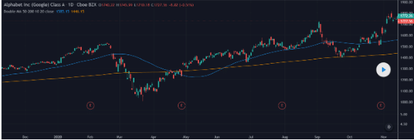
This system involves a moving average crossing another, the signal being depicted at the point of intersection. It is not suitable, however, for a financial asset that is showing sideways movement.
Firstly, the two MAs must be plotted on the chart, and the time frame for one must exceed that of the other. For this purpose, you have various MA pairs, like 5-20, 12-24, 10-30, 10-50, etc., with the unit for all of them being days.
Normally, when the MA for the short-term intersects the long-term MA and advances upward, it triggers a buy signal. Conversely, as the short-term MA goes below the long-term MA, a sell signal is triggered. The basic concept behind this is the same as in the case of a single MA system since a price smoothing takes place at this point.
There are a few traders who add another criterion to the buy signal that the longer-term MA must be moving upwards.
#2 Golden/death cross
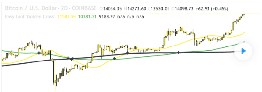
The Golden Cross phenomenon takes place in the market when the shorter-term MA crosses above the longer-term MA. This tells traders that a bullish movement is about to happen. For several traders, this is the go-to chart pattern because it gives them a certain indication of a buy signal.
Nevertheless, there are some experts to invalidate this pattern, mainly because there is not much research to back up its claims as a legitimate and efficient trading tool. The opposite indicator is known as the Death Cross, which takes place when an asset’s short-term moving average falls below its long-term moving average. This phenomenon indicates a downward trending or bearish market.
The Golden Cross lets traders decide on both entry and exit signals. Additionally, some people may use them to know when to sell and when to buy and hold. It is to be noted that this is a lagging indicator that might not appear until some time has passed after the shift from bearish to a bullish market.
#3 Bollinger Bands

As we mentioned before, moving averages also form the base for other indicators like Bollinger Bands. This indicator consists of lines that are drawn two positive or negative standard deviations away from the prices’ SMA, or Simple Moving Average, which represents the average value of the asset’s price over a certain time period.
By studying Bollinger bands, a trader gets to know how volatile the stock is. The widening of the bands depicts the increasing volatility of the market, whereas when they contract, the volatility is said to be lower.
Furthermore, when the price of the asset crosses the upper band, it signals overbought security, where traders anticipate the price to move back between two bands later on. Conversely, when the price crosses the lower band, it signals that the security is oversold. For best results, you should use those in tandem with other indicators.
#4 Moving Average Envelopes
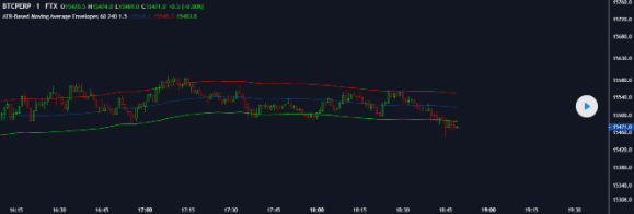
MAE or Moving Average Envelopes is a technical indicator where we plot some lines at certain distances below or above a price’s MA, which can be simple or exponential. Generally, the SMA is taken for a 20-day period, and the distance percentage is taken as 5%. The pattern thus consists of parallel bands following price action.
The rationale behind this indicator is that overeager traders cause the prices to reach either extremity, after which they get stabilized and display realistic values. When the asset’s price reaches the top band and moves downward, the asset is said to be overbought. In contrast, when the asset’s price starts to move upward after reaching the lower band, the asset is said to be oversold.
#5 Moving Average Convergence Divergence
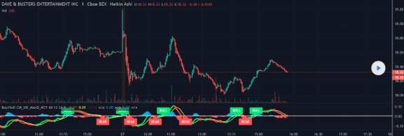
The Moving Average Convergence Divergence or MACD is used for depicting the relation between EMAs. It consists of three main components – a red signal line, a blue MACD line, and a green histogram that shows the gap between the red and blue lines.
The blue line depicts the gap between two EMAs, generally calculated over 12- and 26-day periods, whereas the red line is usually taken as the exponentially weighted moving average of the blue line. All these lines keep wavering in and around zero, which makes the MACD indicator similar to an oscillator that indicates overbought and oversold regions around the zero lines.
Traders use MACD for measuring the strength of a trend or a momentum by taking the zero line as the base. An uptrend is said to be indicated when the MACD intersects the zero line and moves upward. When it intersects the zero line and moves downward, it is an indication of a downtrend.
It can also be used to determine the perfect times for buying and selling stocks. When the MACD goes above the red line, traders take it as a buy signal, and when it falls below the red line, they take it as a sell signal.
Summing up
The above-mentioned charts are similar in the following ways:
- They all indicate price smoothing.
- They depict continuous trends.
- They show the relation between prices from two different time periods.


Leave a Reply