The Ichimoku cloud is an intriguing, Moving Average-based indicator providing traders signals regarding support and resistance, momentum, and trend.
The full name of the indicator is ‘Ichimoku Kinko Hyo,’ which translates to ‘a glance at a chart in equilibrium.’ While this esoteric statement sounds like something you’d hear in a Zen, the Ichimoku is a frequently utilized tool due to its diverse capabilities.
The Ichimoku works across all time frames and markets, befitting its enduring popularity globally. Yet, visually, it can turn off some less knowledgeable traders. Fear not, as the indicator isn’t tricky to use once you grasp the basic concepts.
How the Ichimoku cloud is calculated
At its core, Ichimoku consists of five distinct colored lines. Two of these (typically orange) form the all-important kumo or ‘cloud.’ This indicator is available on most trading platforms with default settings that you can modify to your own needs.
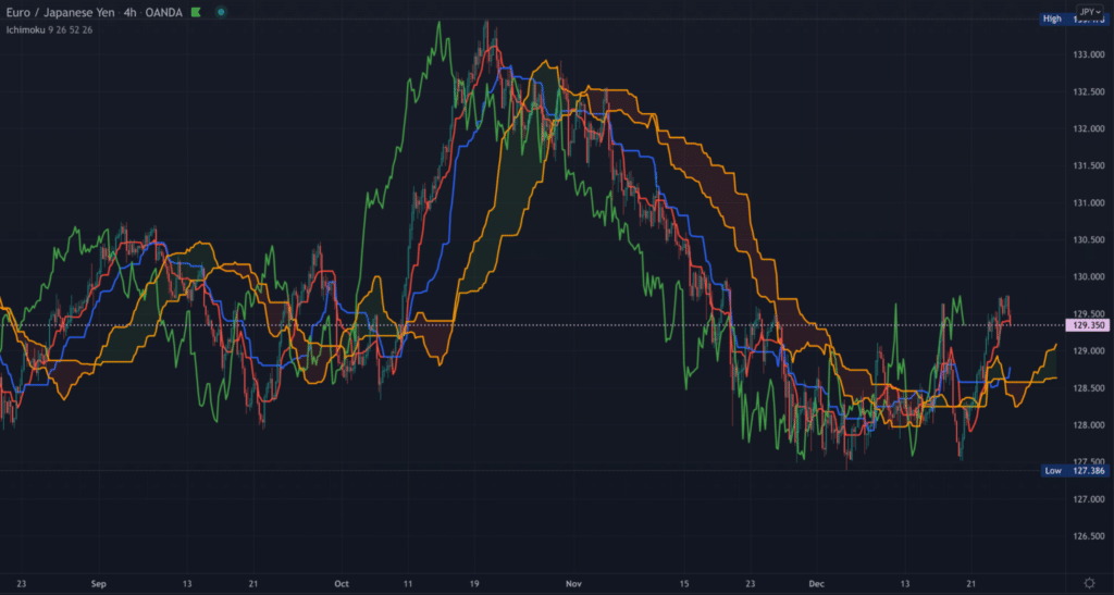
For ease of use, it’s best to familiarise yourself with the standard colors for each line – remember most of these like BRG or blue-red-green. Below is an image of the Ichimoku for you to follow along (chart 1).

- Kijun Sen (blue): This is regarded as the base or standard line. It’s calculated by taking the highest high and lowest low over the last 26 periods and dividing it by two.
- Tenkan Sen (red): This is regarded as the conversion line and uses the same calculation as the baseline, except it’s over the past 9 periods instead of 26.
- Chikou Span (green): Also known as the lagging span, this line consists of the closing price shifted 26 periods behind. The idea behind this lag is to enable analysts to visualize how the present price action compares to that which is 26 periods before.
Essentially, if the market is above this line, it’s an early sign of an uptrend; when below it, it’s an early sign of a downtrend.
- Senkou/leading span (orange lines): All the previous lines produce the cloud. The leading span A (first orange line) is calculated by averaging the conversion line/tenkan sen and baseline/chikou span and dividing that by 2.
The leading span B (second orange line/outer edge) is calculated by averaging the highest high and lowest low over the past 52 periods divided by 2 and then plotted 26 periods ahead.
One distinct feature about any Ichimoku cloud strategy is how the lines attempt to project future support and resistance levels, unlike most tools relying primarily on past data. However, this doesn’t make the indicator supremely predictive than others; just unique.
How to interpret Ichimoku cloud
The remarkable element of this indicator is, of course, the cloud. However, other uses for this tool exist.
- Overall trend direction: When the price is above the kumo, traders consider this a bullish sign; at this point, the cloud is automatically shaded in green. Conversely, when the price is under the kumo, traders regard this as a bearish sign; the cloud is automatically colored in red at this stage.
If the price sits somewhere between the cloud, this is considered a range. As the cloud expands, the stronger the trend becomes; the weaker it becomes as it contracts.
The cloud’s angle is another reference point in trend direction with the Ichimoku. As the slope becomes steeper in a bullish trend, the higher prices are expected to go. Conversely, if the curve starts pointing downwards, the lower prices are expected to go.
- Early trend identification/crossovers: Experts can identify early trend changes by looking at the behavior of the base/blue and conversion/red lines. When the blue line goes above the red line, it’s an early sign of a potential bullish move.
On the other hand, when the baseline goes above the conversion line, it’s an early trigger of a potential bearish move. When either of these events happens while the price is above or under the cloud, it adds extra weight to the trade. Traders can use this ‘crossover’ as an exit trigger when in a profitable position.
- Support and resistance identification: The cloud itself plots where critical levels will likely be in the future. So, when the price is above or under the kumo, traders can gain a good sense of where a retracement could happen.
Trading example
Now let’s take all this information we’ve covered and illustrate a simple example of generating a trading idea. The higher up in time frame you go, the more significant move you should expect.
To make things simpler, we’ve outlined below the main factors to observe in formulating a buy and sell signal, respectively.
Buy signal:
- The price must be above the cloud, which would have turned into a green shade
- The conversion/red line should be above the base/blue line
Sell signal:
- The price must be under the cloud, which would have turned into a red shade
- The base/blue line should be above the conversion/red line
Example
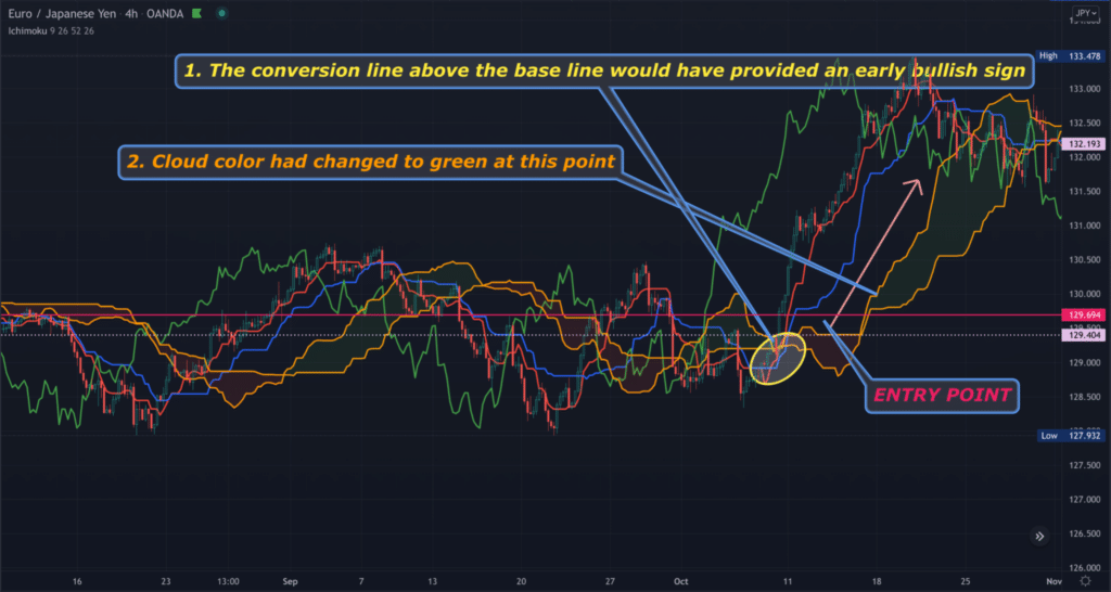
The chart below demonstrates a recent buying signal on EURJPY (Chart 2).

A trader would have entered into the position at the point near the yellow ellipse marked ‘ENTRY POINT.’
Conclusion
One frequently cited and understandable limitation of this tool is how it can make one’s charts appear cluttered. Fortunately, most charting platforms should allow users to remove any lines they wish.
The significant lines for most are the base and conversion lines, along with the cloud. Another drawback worth noting, prevalent in all indicators, is the lagging nature of the Ichimoku.
Therefore, as with any technical tool, using this indicator as a standalone isn’t recommended. Ultimately, if you’re looking for a ‘jacked up’ version of Moving Averages, few indicators can beat the Ichimoku cloud.


Leave a Reply