
Rectangle tops are horizontal patterns drawn as parallel lines from comparable high and low-price positions. Prices lead up to the formation of the pattern, and they oscillate in a trading range over a short time. During this range, the prices move in a wavy or a W-shaped trendline with at least two high positions and two low price positions.
The trader can compare these two positions by drawing parallel lines touching these two price points (highs and lows) to form the parallel lines. These lines appear like a rectangle. The pattern mostly represents a bullish continuation trend in the short term.
In the case of an upward breakout, the rectangle top will dictate a bullish continuation, but with a downward breakout, the rectangle top will give way for a bearish reversal. The main aspect of this pattern is that prices will first rise to their formation. This principle will guide the trader to ensure he understands the breakout direction as well.
Identifying the rectangle top in a chart
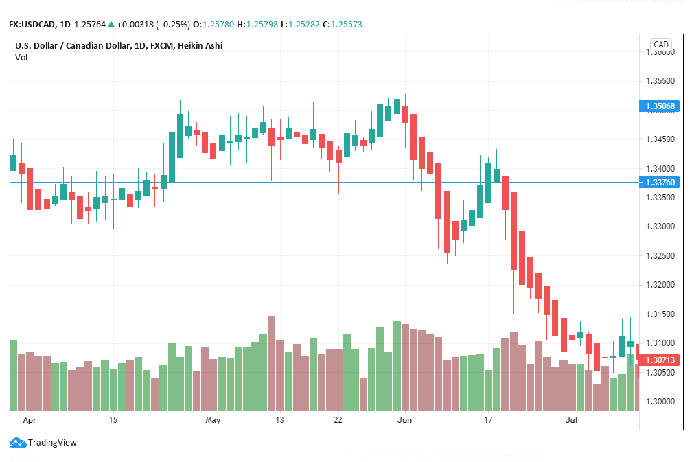
Figure 1: Rectangle top in USD/CAD chart
- Rising prior trend
The rectangle top pattern from the left side has been formed by a prior rising trend. Prices are seen to rise from 1.33000 to 1.35068 during the formation of the pattern. However, after the pattern crosses the right side, it experiences a downward breakout.
The USD/CAD formation has led to a bearish reversal rather than a bullish continuation. The rising price trend that led to the pattern’s formation was short and narrow. This feature meant that the bullish continuation could not be sustained by the pattern in the short term. In the case of a short and narrow prior price trend, the trader has to be prepared to short the pair rather than buy or go long.
- Horizontal lines
Figure 1 shows that there are two horizontal trend lines formed from the W-shaped price movements in the trading chart. These parallel lines coincide with the volume adjustments as the pattern takes shape. You will note that the red volume bars gradually increase as the green bars decrease. This feature shows that the pattern is likely to be followed by a downward breakout.
The upper trendline forms the resistance, while the lower trendline is the support. Since figure 1 represents a downward breakout, the lower trendline continues to form the resistance level for the trading pair.
- At least two touches at the trendlines
The horizontal lines should touch at least four points on the price trendlines. The four points are divided into two high points and two low points. Figure 2 shows that the pattern forms a correct rectangle top. It touched the bottom trendline on April 30, 2019, and May 9, 2019. The top horizontal line touched the price point on May 9, 17, and 29, 2019.
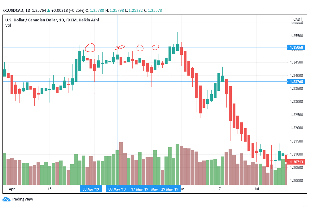
Figure 2: Horizontal touchpoints
- Volume
When the trade is preparing for a downward breakout, there is an upsurge in the volume. In most trends, especially in the case of an upward breakout, volume recedes towards the breakout. Figure 2 shows that there is an increase in the volume of the red bars nearing the downward breakout. The increase in volume should tell the trader to prepare to sell the forex pair rather than buy. Volume has continued to increase from May through to July 2019, supporting the sell position.
The little breakout volume suggests to the trader that many traders did not find the level of trade as significant. Note the failure of the increase in price towards the breakout position. This failure will denote that the price will fall below the resistance line and find new support.
Trading strategy
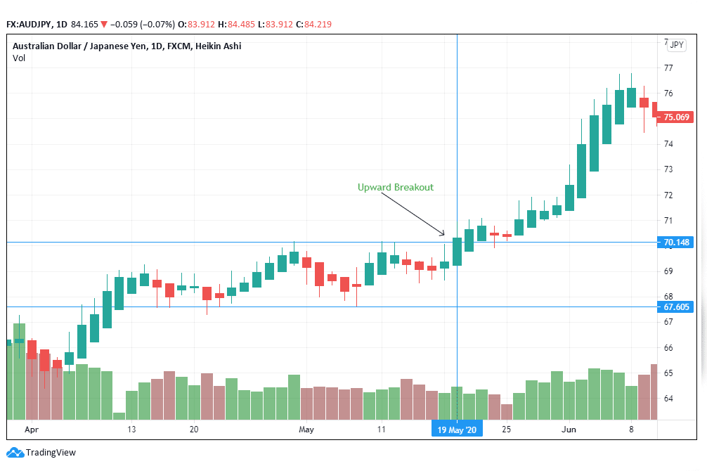
Figure 3: AUD/JPY
- Breakout identification
Figure 3 shows an upward breakout from the rectangle top as opposed to figure 1 that has a downward breakout. As suggested earlier, an upward breakout is followed by an increase in price. After reaching the breakout on May 19, 2020, prices rose from 70.148 to almost 77.000. It will be noted that volume recedes as the trendline nears the breakout. The gradual decrease in volume will prepare the trader to initiate a long or buy position in favor of the AUD.
You will need to open the trade position immediately after spotting the rectangle breakout. Look out for the pause in the price trend as the market adjusts. If the rectangle dictates a bearish position, as is the case with figures 1 and 2, then you will sell the stock.
- Have a stop loss
A stop-loss will come in handy after identifying the rectangle top and the breakout direction. If the breakout is on the upside, the trader will place the stop-loss between the two parallel/ horizontal lines.
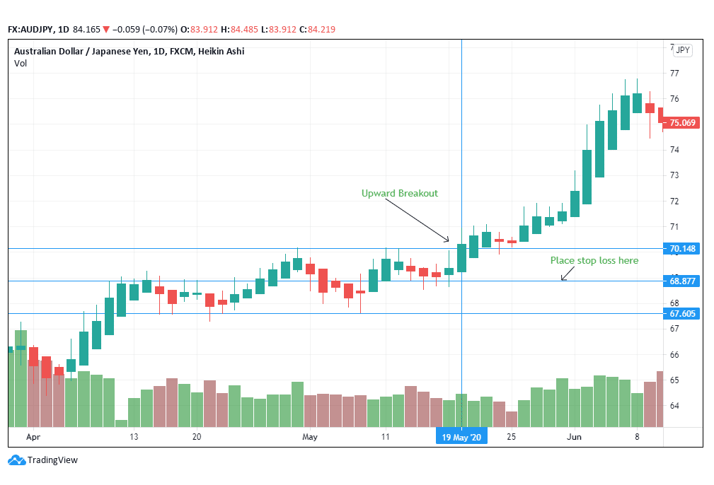
Figure 4: Stop loss position in an upside breakout
In the case of figure 4, the stop-loss has been placed at 68.877, which is the middle position between the two horizontal lines. The trader should compute this distance and measure it manually to identify the midpoint. The maximum loss the trader can accrue from the rectangle trade should be similar to the rectangle top’s midpoint.
In the case of a downward breakout, the trader should place the stop loss at the distance half the pattern’s size and above the upward horizontal trendline. This formula is similar to calculating the target price.
- Target price computation
To get the maximum price, compute the length of the rectangle and add it to the breakout position in the case of an upward breakout. In a downward breakout, add the length to the lower trendline.
Conclusion
Rectangle top patterns are an effective way of identifying the breakout direction in forex. In most cases, rectangle tops suggest a continuation from a bullish prior price movement. Bullish continuations are a result of upward breakouts. Here, the volume of the trade bars recedes as the trade nears the breakout. Prices rise above the resistance line and form a new support line. In cases where the rectangle top supports a downward breakout, prices move below the resistance line.



Leave a Reply