In a volatile market, many investors make emotional decisions regarding their trades. Therefore, having logic and reason behind your choices will save you many losses and set you up well for profiting from your trades. Trading indicators are tools that help to understand market sentiment and determine the market direction. This article will discover the seven best indicators for digital currencies.
Moving Average
This is one of the most basic indicators that every trader should master. You can use it on any time frame; however, the most popular are 200-days, 50-days, and 20-days. This can be calculated by taking the sum of the asset closing prices and dividing it by the total number of periods.

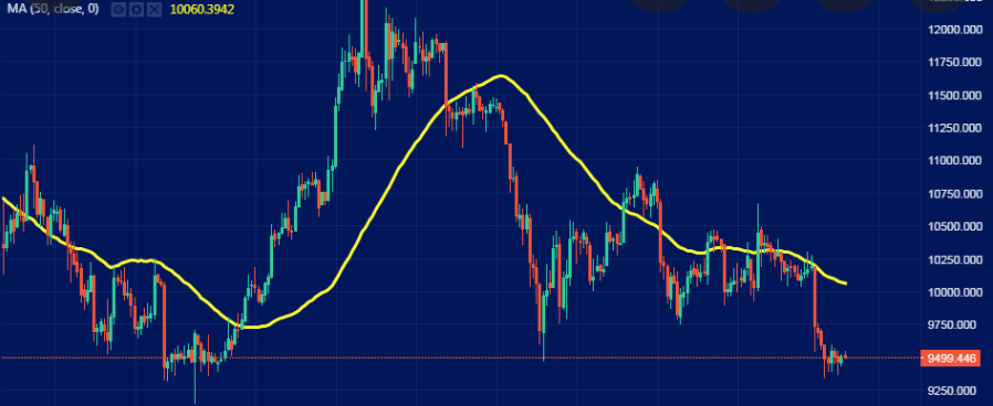
Chart 1. Moving Averages Chart
In chart 1, the Moving Average is represented by the yellow line. This shows the ‘average prices trend,’ which helps you eliminate the noise. Candle charts can sometimes be confusing and misleading. MAs will give you a more holistic view of market conditions and sentiments.
Relative Strength Index (RSI)
Realistically, many people still invest in crypto because it is the ‘hype,’ and they do not have a deep understanding of fundamentals. RSI is the measure of how over/undersold or over/under bought an asset is.
There are two ways you can find the RSI of an asset. Firstly, TradingView gives you a breakdown of the RSI.
You could also calculate RSI using the following formula:
RSI = 100 – 100 / (1 + RS)
where:
RS = average of periods in which price increases/average of periods in which price decreases.
Usually, the average period is calculated within a 14-day window.

Chart 2. Relative Strength Index Chart
If the obtained value is less than 30, the asset can be seen as oversold – you can expect that the price will rebound. Any value above 70, the asset is overbought – you can expect that the price will correct itself in the near future.
Moving Average Convergence Divergence (MACD)
MACD is defined as a trend-following momentum tool that shows the relationship between two MAs of an asset. There are many MACD models available to use on TradingView.

Chart 3. Moving Average Convergence Divergence Chart
Normally, when the MACD line crosses from underneath to over the top of the signal line created by the MACD indicator, the market sentiment turns from bearish to bullish. The opposite is true that if the line initially starts above but crosses and ends up beneath will signal a bearish market sentiment.
Bollinger Bands
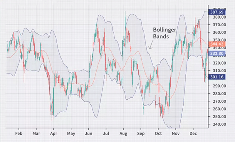
Bollinger Bands gives a range of two standard deviations above and below the MA (the previous indicator mentioned in this article). Through this, traders can deduce the variability of prices within a period of time and the relative strength of these fluctuations. Therefore, this is a tool used to understand how volatile an asset is at a particular time.

Chart 4. Bollinger Bands Chart
The Bollinger Bands can be calculated with the following:
Upper Band = Middle Band + Standard Deviation of price over a period of time x 2
Middle Band = Simple Moving Average over a period of time
Lower Band = Middle Band – Standard Deviation of price over a period of time x 2
The ‘squeeze’ is one of the most interesting phenomena of this indicator. This is when there is minimal difference between the three bands (they are all squeezed together). This shows that the asset’s price is very stable, and there is little volatility.
On the opposite side of the spectrum, if there is a large difference between the three, the price is highly volatile. Another signal when reading the BB chart is when the closing price is outside of the two standard deviations. In these instances, you can expect that there will be a reversal.
On Balance Volume (OBV)
OBV is another momentum indicator. It uses cumulative volume and changes in price to predict the future moves of an asset. If the price surges, the trading volume will be added to the total volume. Conversely, if there is a decrease in prices, the trading volume will be subtracted from the total volume.

Chart 5. On-Balance Volume Chart
If there is a downward pressure in the trend of OBV, we can deduce that there is selling pressure in the market. On the other hand, as OBV rises, there could be a bullish trend forming.
Bitcoin Dominance
Bitcoin dominance is an indicator that measures the proportion of bitcoin market cap compared to the market cap of the whole crypto market. This indicator is prevalent in determining the trends of altcoins in relation to the prices of bitcoin.

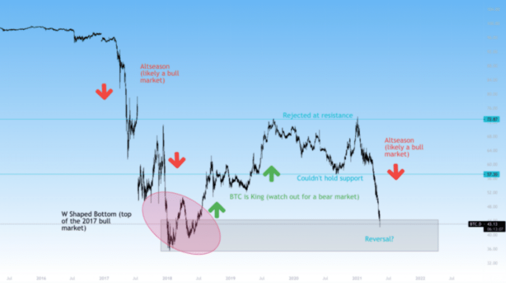
Chart 6. Bitcoin Dominance analysis example
As a general rule of thumb, when this index declines, it is likely that we are currently in a bull market. The reason behind this is that altcoins will grow in market cap faster than bitcoin due to their higher supply. Conversely, when the index increases and BTC is king, it is likely that we are going to be in a bear market.
BTC Fear and Greed Index
This is a simple index that helps determine the market sentiment. It is a 0 to 100 scale, with 0 being extreme fear and 100 being extreme greed.

Chart 7. BTC Fear and Greed Index
A lower number signifies a higher level of fear in the market. This means the general sentiment is bearish. On the other hand, a high level of greed (high index) results in higher confidence and a bullish market.
Concluding remarks
Crypto trading requires skills in chart analysis. Success will depend on your ability to use the tools present to make the best trading decisions at the moment. Therefore, it is important that you are comfortable with the theory and application of these five trading indicators.


Leave a Reply